Makeover for Nestlé Vera
Logo, label and packaging the Nestlé Vera (Sanpellegrino Group) mineral water bottle, chosen daily by more than 8 million families, have been overhauled, further evoking the brand’s key values: “the family, quality and sustainability”.
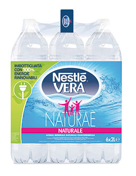 The emphasis is on the source and reliability of the product, along with direct and immediate communication with the consumers: local water resources, commitment to environmental protection feature in the brand’s multiregional approach, with awareness messages that encourage segregated collection, as well as a mention (in particular on the labels of the 6 bottle bundles from the source, “Naturae”) of the issue of reducing fossil fuels, totally zeroed at the the company’s Castrocielo (FR) plant, which uses 100% of energy from renewable sources...
The label also further emphasizes the link with the Nestle Group, that this year celebrates its 150th anniversary, whose brand features greater on the logo. The iconic elements though of water and family, that best interpret the identity of Nestlé Vera, have remained unchanged.