Pantone introduces 54 new metallic colours for premium packaging
To address the growing metallic trend in the premium packaging segment, Pantone recently introduced a series of new metallic colours for high-end packaging and graphic design.
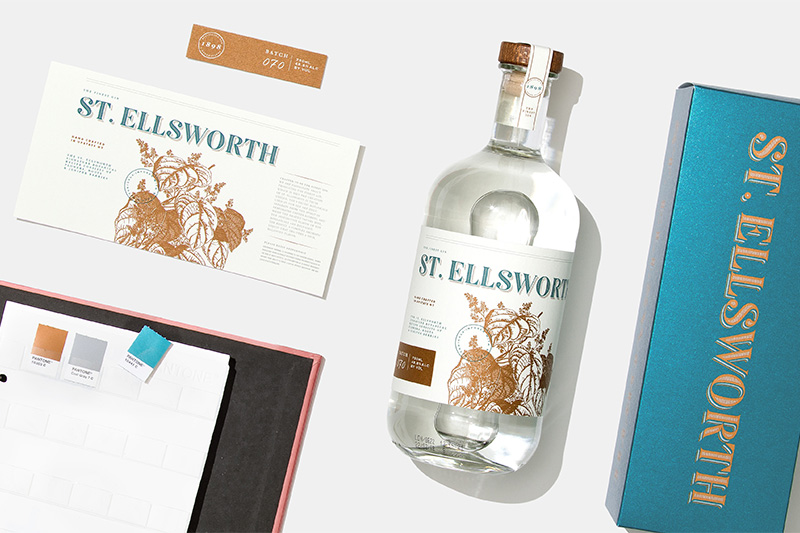
Artful Simplicity Palette
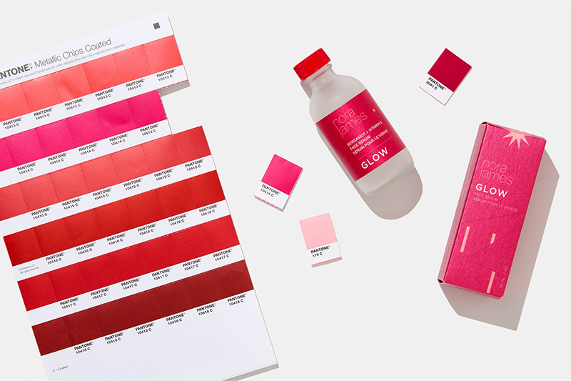
The US colour specialist is further expanding its already wide range of metallic shades with the introduction of 53 new trend-driven colours, including punch red, mint green with teal and coral (colour of the year for 2019) as well as an innovative Rose Gold ink used for formulating more than 25% of the new colours. The full selection features 665 metallic shades.
Pantone believes metallic printing inks are an increasingly effective alternative to foil stamping and identifies “sparkling” packaging as a competitive advantage for luxury goods. The expansion of the colour collection reflects a growing awareness of luxury packaging’s ability to “capture and captivate the eye, adding visual texture and differentiation from surrounding products on-shelf”, explains Laurie Pressman, Vice President of Pantone Color Institute.
The 54 colours recently added to the Metallics packaging design line were inspired by the new Pantone Metallic Shimmers, recently added to the Fashion, Home + Interiors System for product design in key lifestyle segments. For designers and suppliers working across materials, this alignment helps ensure that print and packaging colours can be more easily matched to products.
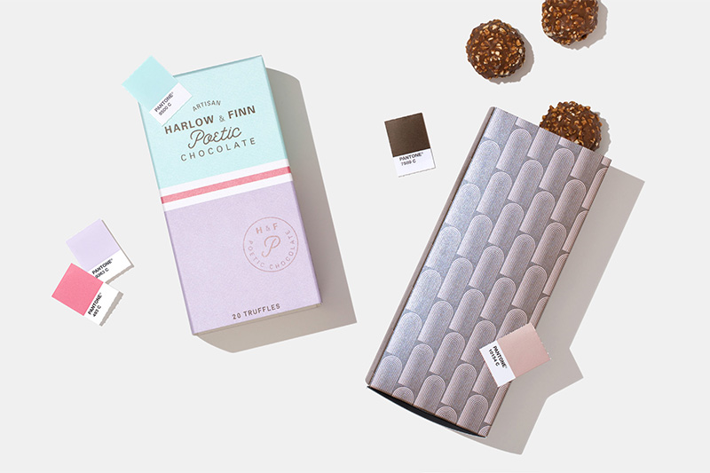
Poetic Sweetness Palette
Sensual Passion and Punch Palette