Italian Packaging Oscar 2014
The Quality design of Italian packaging will go on show from 8th to 13th April in Milan. Among the fringe events in the Brera Design District this year, there will in fact be a space set up at the Mediateca Santa Teresa (via della Moscova 28), dedicated to the 15 finalists of the contest organized by the Istituto Italiano Imballaggio. The awards ceremony will be on April 9th.
A number of actors have staked much on the traditional annual competition, that aims at clarifying how the proposed packaging solutions on the one hand respond to the consumers’ need for service and information, but also to that of the visibility, recognisability and communication demanded by the brands: packaging producers first and foremost, and obviously the Istituto Italiano Imballaggio, that has worked in close cooperation with the Milan Polytechnic Design School and enjoys the sponsorship of Altroconsumo, and then there is Conai (Consorzio Nazionale Imballaggi) as well as Ipack-Ima 2015. And lastly Studiolabo, curators of the installation as part of Visionica.
Who will win and why. This year hence the lead thread for the evaluation of the competitors will by the design quality of packaging, or that is the balance and harmony between the communicative, structural and functional dimensions of the proposals.
With a special attention for the receiver/user, hence the innovations in the graphic language and the use of communicative elements designed to express the brand and product identity will be judged, along with correlated values (communication serving environmental sustainability).
Equal consideration will also be given to the aspects of accessibility and the inclusiveness of the packaging: the innovations that facilitate access to and use of the product, this through a clear and attentive communicative-structural articulation and a care for the quality of the information expressed, also within the prospect of a “design for all” extended user base.
Hence once again the Packaging Oscar freeze frames the evolution of research regarding packaging and the solutions to the problems of transport, protection, safety, but also facility of use and handling by the professional user or final consumer.
The winners will be proclaimed April 9th at 4pm, during a packaging design lesson held by Valeria Bucchetti, associate professor of the Design Department of the Milan Polytechnic.
Note: the material published has been elaborated on the basis of the communiqués provided by the Istituto Italiano Imballaggio.
Acqua Minerale San Benedetto Spa - Coop Italia Soc. Coop - Deco Industrie Scrl - Goglio Spa - Icimendue Srl - Illycaffè Spa - Newbox Spa - Novacart Spa - O-I Manufactoring Italy Spa - P.E.T. Engineering Srl - Scatolificio Cristina Srl - Sealed Air Srl - Smurfit Kappa Italia Spa - Tetra Pak Italiana Spa - Verallia Saint-Gobain Vetri Spa
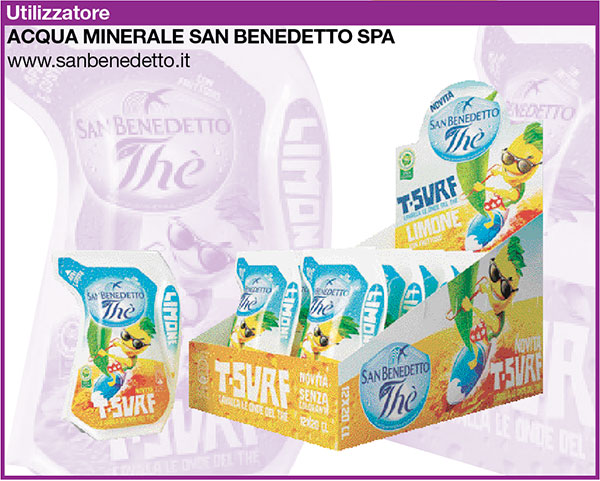
1 Ride the wave with “T-Surf”
Thè San Benedetto, Italian families’ most loved ready-to-drink tea, has added further innovations to the sector with a new and exclusive format.
The company is known for always providing consumers with what they really want and responding to the needs of a market that is in constant evolution; San Benedetto is adding an extra dash of vitality to its range of teas through “T-Surf”: a pack that is unique, totally inspired by the sea, the waves, the colors and the cool sensation of a summer trail that lasts all year round. Available in a 20cl format its useful handle makes it practical, easy to use, smart and fun, with the guaranteed and unmistakable flavour of San Benedetto.
The Venetian company is always on the same wavelength as its young consumers and the new generations: it knows how to indulge their tastes and encourage their love of play and imagination with highly attractive initiatives. And it is their desire to encourage young people to consume a healthy and high quality drink that led them to surprise us with “T-Surf”.
This new product, with added fructose, comes in two flavours - Peach and Lemon - and was created in order to have a refreshing and thirst quenching Thè San Benedetto drink always at hand that could be enjoyed in a more unusual and fun way at any time of the day: just tear off the corner of the pack and insert the straw provided… that’s all it takes!
The pack’s colourful and attractive design feels fresh even to the touch and stands out because it is light and practical: it can easily be carried in bags or backpacks without breaking as it is very flexible.
“T-Surf” is an innovative way of offering a good quality, traditional drink such as tea, free of colourings or preservatives and gluten free, and just right for those who love to “ride the wave”.
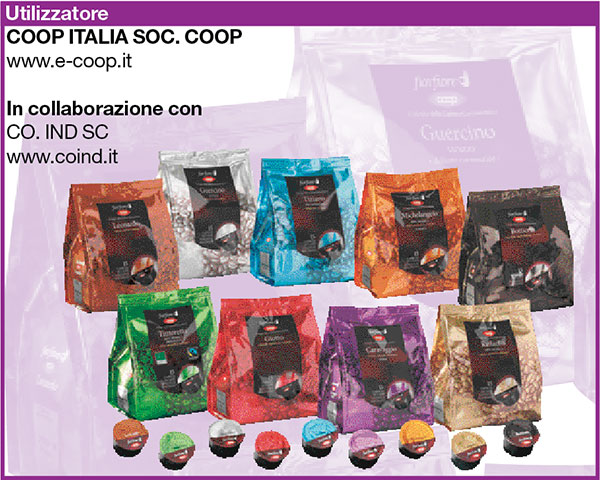
2 Coffee: sustainable capsules
With the aim of satisfying the rise in coffee consumers using monodose systems while still remaining loyal to its brand’s values, at the end of 2012 Coop launched its “Fior Fiore Coop roasted and ground coffee capsules” line.
The espresso coffee machine which is being launched with the new product has a number of distinguishing characteristics and is entirely Made In Italy - including its design, technological features and the actual assembly of its components.
It took nearly two years of research, in close collaboration with manufacturers Co.Ind. Soc. Coop., to create a capsule which was environmentally sustainable and, at the same time, compatible with the standards of quality, safety and good value which have always defined Coop products.
At the heart of the solution lies the peelable seal created by Co.Ind. Sc complete with a special tab, patent pending, which, after consumption allows the consumer to open the capsule manually and easily separate its components and empty out the coffee dregs. In this way the dregs can be recycled and placed with the household’s organic waste.
This solution avoids the wastage that occurs with traditional capsules which, after being used, remain full and are therefore thrown away with non-recyclable waste: this process gets rid of the coffee dregs, a great soil improver which can be reused as a secondary material.
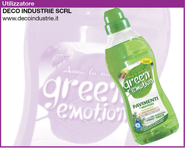
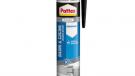
3 Green Emotion Detergents
In 2013 Deco Industrie launched an eco-friendly line using natural ingredients and fully recycled plastic bottles in answer to the growing number of consumers looking for a healthier lifestyle, greater personal well-being and more environmentally friendly chemical solutions. It was named Green Emotion in order to immediately convey the green aspect of the product whilst also hitting an emotional button.
Green Emotion products are concentrated and so use less water, tested for their effectiveness at low temperatures, produced with natural biodegradable raw materials, phosphate free, hypoallergenic, nickel and chrome allergy tested and, lastly, not tested on animals.
Each one of the products in this line is scented using natural essences, each one with specific beneficial properties which are consistent with what the product is used for: relaxing lavender essence for washing machines, softening rose essence for wool and delicates, reinvigorating Jasmine essence for fabric softeners, lemon based antiseptic for dishes and a pine and spruce decongestant for floors.
So, the entire Green Emotion line is eco-friendly, including the packaging because the bottles are made of 100% recycled PET, sourced from recycling banks and the secondary packaging uses bundles instead of cardboard. This packaging system - the only one in Italy in the detergent sector and already patented - means fewer trees need to be cut down and that there is less CO2 pollution because of a reduction in the plastic and cardboard production processes.
Benefits include transport optimisation as well as several advantages at the retails outlets, such as less time filling shelves, lower costs and less time lost disposing of the cartons and greater visibility at the front. In order to convey its Green philosophy, the Green Emotion graphics are based around concepts and colors that evoke positive messages: green leaf, ladybird and the “Love nature” pay off, because respecting Nature thanks to the choices and actions we take should trigger emotions every day.
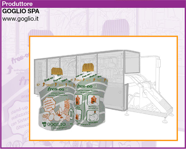
4 Goglio Fres-cool, tastefully cool design
Goglio has launched Fres-cool, the brand-new stand-up monodose pouch with a fully flexible spout, enhanced by a special protective peelable film. Aimed at the beverage sector Fres-cool replaces traditional dispensing nozzles in rigid plastic, with improvements in terms of size, volume and cost thanks in an irresistible pack with elegant silhouette and well-proportioned shape.
Its innovative design has been developed with the highest level of consumer hygiene and safety in mind: the special “keep clean” protective film, which can be clear or bear a design if required by the customer, guarantees that the spout is protected from all external agents.
Ideal for juices, fruit concentrates, yoghurt drinks, tea, energy drinks, water, dessert toppings, creams and whipping creams, Fres-cool is the ideal packaging for kids’ snacks, sports enthusiasts and outdoor lunches. At the cinema, theatre, concert or sports event the new Goglio stand-up pouch is light and discrete, sturdy, safe (there are no sharp edges) and practical: peel back the film, open the spout where shown and enjoy your favourite cool drink without giving it another thought!
Fres-cool’s packaging is an excellent way to display customised and high-resolution graphics: by overlaying the film on the actual stand-up pouch customers can give free rein to their imagination and create innovative overlaid designs, creating an irresistible and highly marketable product.
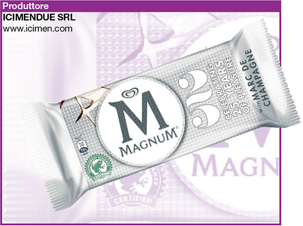
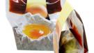
5 Special wrapper for a special Magnum
In honour of the limited edition Marc de Champagne Magnum, conceived by Unilever to celebrate the “silver” wedding anniversary of its premium brand, Icimendue, the historical flexible packaging converter, has developed an original wrapper which showcases its consolidated experience in the fields of rotogravure and plastic film metallizing.
The ice-cream, coat ed in milk chocolate and a silver glaze, was produced and conceived to mark its 25th anniversary and needed to be dressed and embellished by an especially attractive and unique wrapper. Consistently with the theme of the project, based on the concepts of silver and champagne, the idea was to use holographic materials and a bubbly effect.
A holographic and metallic flowpack, decorated with an originally repetitive design reminiscent of Champagne bubbles, was created thanks to the full commitment of the research team and a skilled and coordinated taskforce. Not only: Icimendue experts managed to match the technical characteristics that the customer uses for its standard flavoured ice-creams and maintain the same packaging production standards.
The Marc de Champagne Magnum will be distributed throughout Europe.
The wrapper consists of a cold seal laminate which uses only polypropylene and is obtained using a co-extruded OPP film, combined with a special hologram film with 3-D effect. Icimendue was responsible for implementing both the metallization and printing phases, with the latter being achieved using binding and spreading of the cold seal, in line on an eleven element gravure press.
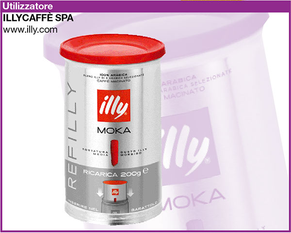
Illycaffè: 200 gram Refilly
Refilly is illy’s new 200 gram coffee refill for its 250 gram tins. It features as a true innovation in the ground coffee market, because it is the first and only pressurised 5 layer polypropylene-aluminium polylaminate pack.
Two proprietary patents guarantee the quality of the product inasmuch as, thanks to the pressurisation, all the best characteristics of the coffee remain inside the pack. Refilly is the result of the cooperation between illycaffè, that created the idea and the concept, Huhtamaki, that contributed to creating the packaging technology, and Optima, that produced the FFS packaging line
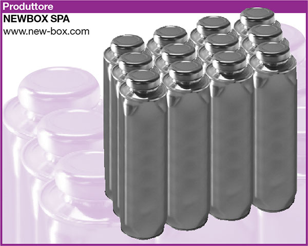
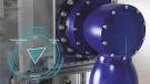
7 Twist can: reclosable, space saving and ecological
New Box SpA presents the three piece patented 75 cl “twist can”, that can contain any type of beverage, flat or carbonated. It is a single component container, made 100% in steel, designed to be safe and hygienic and fitted with a new reclosable steel top (for vacuum and/or carbonated). Not only that: the new can is “space-saver” thanks to the cubical shape, especially studied to optimize space in the transport phase and when displayed on the shelf.
Particularly significant too the environmental pluspoints: the use of a single type of material facilitates recycling; as well as that, thanks an assiduous research aimed at downgauging, New Box has reduced the use of raw materials by 15%, generating considerable savings. The other key factor on the level of compatibility is the high percentage of recycled material: the can is made up 56% of recycled raw material.
New Box SpA has a certified UNI EN ISO 14001 and 50001 grade Energy and Environment Management System.
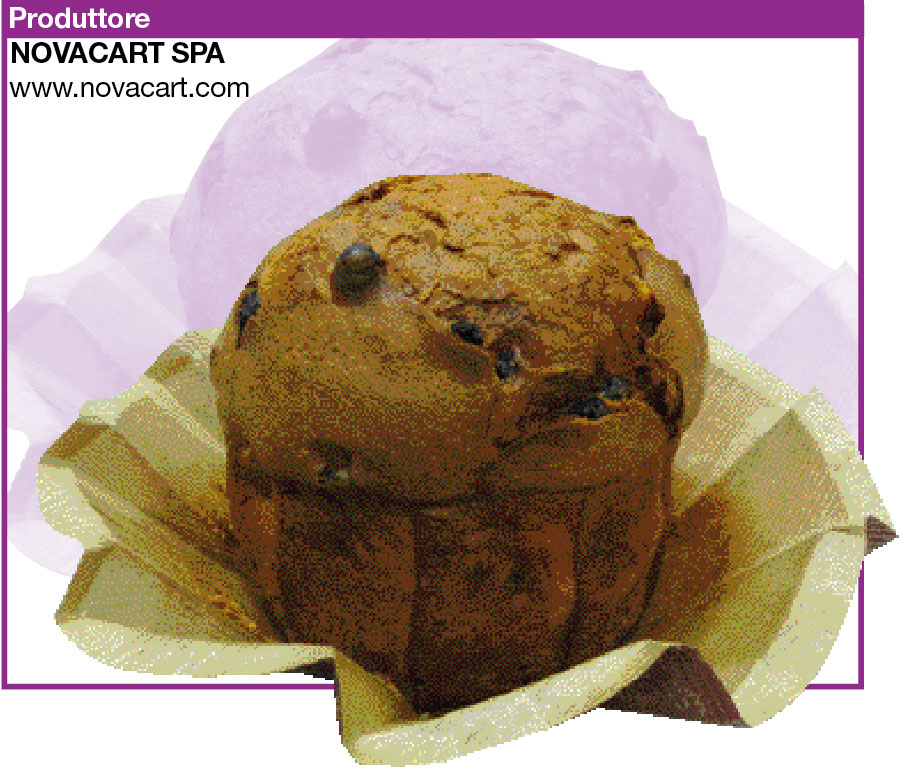
8 “Gardenia” polygonal baking mould
The open container takes on the shape of a gardenia and thus this is the name of the baking mould offered by Novacart, a container in microwave food paper, suitable for baking in the oven, polygonal in shape that comes in various sizes.
The structure is finished with a folded edge along the entire upper perimeter, that guarantees excellent raising resistance for bakery products. This particular type of edge, what is more, ensures a series of other advantages: it enables the mould to be closed without requiring glue and facilitates the opening in the moments in which the product contained has to be cut. Indeed pulling the corner of the upper edge and opening all the sectors, Gardenia lastly turns into a tray that gathers any crumbs from cutting. Not only that: the polygonal division gives the product contained a trace that helps cut equal portions. Hence, thanks to all these features, Gardenia is a health friendly, eco-compatible container, with an excellent resistance to raising mixes and particularly easy to open, and with a high service content.
The broad possibilities of printing the outer part enable extensive personalisation.
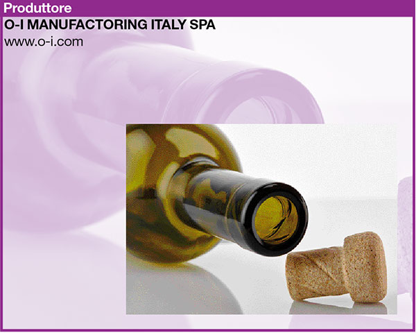
9 Helix: unexpected twist of cork and glass
Helix (www.helixconcept.com) is an innovatory packaging solution designed by Amorim and O-I for the medium-high range of wines. It is the result of a partnership that came into being 4 years back between two big manufacturers, respectively of corks and glass bottles, with the objective of responding to the growing demand for sustainable products and, at the same time, to guarantee the consumer quality and convenience of use: Helix enables the bottle to be simply opened and closed several times, using a single combined solution of cork/glass.
The new “concept twist to open” associates the ergonomically designed cork stopper to a glass bottle with an inner thread in the neck, creating a sophisticated, high performance packaging. Hence Helix associates all the benefits of cork and glass - quality, sustainability and that premium image that the winemaking concerns transmit via packaging - with the practicality of a reclosable opening. As well as that, it can be speedily and easily implemented by the wineries, with minimum adjustments to the existing bottling lines.
This new concept hence creates a modern product, 100% recyclable, that exalts the sensorial experience of wine.
As verified during the numerous tests carried out by Amorim and O-I, the product preserved with the Helix system does not suffer alterations of flavour, aroma or color. As well as that, according to market studies carried out in France, UK, USA and China, its use for packaging quality wines has experienced considerable success. Much appreciated also by consumers its classic “pop”, the typically festive sound associated with the uncorking of wines bottles.
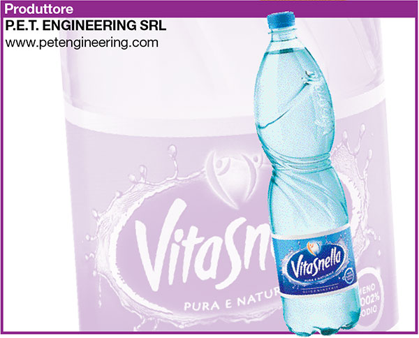
10 Vitasnella, expression of wellbeing
Acqua Vitasnella presented itself on the market with a packaging that, even if deeply rooted in the imagination of Italian consumers, was out of line with its dynamic, modern advertising with a touch of glamour of these last years.
While enjoying great notoriety, Ferrarelle has decided to revamp the image of Vitasnella with a restyling that not only enables the transmission, via the most up-to-date aesthetic and iconographic codes, of the brand promise, but that also improves the performance and the ergonomy of the packaging, making it coherent with the quality perceived by the consumers.
The restyling levers on the benefits of the brand promise, or that feeling light and shapely, that has been translated into the streamlined and harmonic shape, obtained thanks to the reproportioning of the upper and lower parts of the bottle.
The lightness has been rendered visually, eliminating the complex decorative apparatus of the preceding version and inserting a graphic motif that, starting from the shoulder and running sinuously along the body, symbolises the water entering into the organism and the elimination of excess liquids and toxins.
The graphic motif not only acts as signifier but also as a structural element that, reinforcing the gripping area studied according the ergonomic and anthropometric criteria, turning the packaging into the perfect “tool” for a physical exercise that can be done by everyone: drink Vitasnella water.
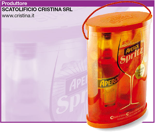
11 Travel Pack Campari Aperol Spritz
Scatolificio Cristina - The Transparent Packaging has been producing transparent packaging in PET, PET-R and PP for 45 years. For its customer Campari, the company has created a travel pack with a peculiar feature: the optimisation of transport volumes and costs from the manufacturing site to the packaging works.
The Campari Aperol Spritz travel pack has been created to satisfy the need for an innovatory pack, in which the brand is highlighted and has a strong visual impact, capable of standing out from its competitors and strongly appealing to the main target group.
The packaging in question is used in the Duty Free, which has raised many problems associated with the location of destination: the strong competition from other products, the need to create a packaging capable of protecting the contents during the air trip, the essential convenience of transport for the customer.
Hence a cylindrical pack with an oval base was created, capable of containing two bottles of different heights and interchangeable, that though is handed to the customer in the form of a glued and printed flat strip. Destructuring the classic cylindrical container, Scatolificio Cristina has considerably reduced CO2 emission associated with road transport, at the same time optimising the palletisation of the various components and has enabled the customer to pack the product ‘just in time’, thus considerably reducing the space taken up by the packaging in storage.
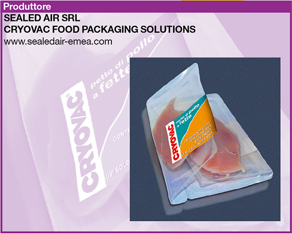
12 Cryovac® Darfresh® Flex Flex+
Sealed Air’s new packaging system Cryovac® Darfresh® Flex Flex+ brings undeniable advantages to the “protein” sector. Light and sustainable it satisfies the increasing demand for portioned packages; it is easy to use and fulfils the need for practicality and for cutting food wastage. It also makes it easier to use an individual portion without opening the ones that are left, which can then be placed back in the fridge or freezer.
The Darfresh® Flex Flex+ solution has evolved from the case ready sector Darfresh® packaging system and offers high operational efficiency, excellent quality and a longer life. The wide range of top and bottom barrier films guarantees that packages remain intact and provides higher food safety levels.
The surprising “second skin” effect of Darfresh® Flex Flex+ follows the contours of the product and is ideal for vertical and high impact displays. On-shelf differentiation is also guaranteed thanks to several printing options.
Single portion and multipack packages have an easy-to-use opening, are airtight and preserve the colour and flavour of products even during transportation and storing. As far as meat is concerned the aging process continues in its packaging, making it more tender.
The vacuum packing process, together with the multilayered hermetic films which provide a thick barrier, ensures that food lasts longer during the distribution cycle and that the products reach the end consumer in perfect condition, irrespective of the distance between the production plant and the retail outlet.
As well as for its technical innovations this packaging is valuable for its sustainability, thanks to:
- a reduction at source of the resources deployed and of pollutants (very thin structures, lighter packaging, size kept to a minimum and space is used more effectively resulting in fewer harmful emissions being released during transportation and management of the cold chain);
- less waste as content is preserved longer (less food is wasted) and reduced packaging (lower impact on the product’s life cycle).
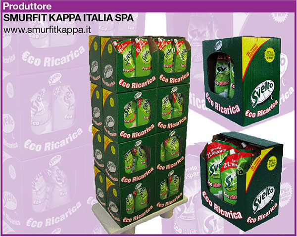
13 Golfing Project
Creating the Golfing project, Smurfit Kappa and Unilever have developed a RRP (Retail Ready Packaging) that has enabled saving on raw materials, time and management costs, at the same improving functionality and design.
The problem to be faced was presented in these terms: the Svelto detergent pouches were packed in boxes, that were eliminated on delivery to the subcontractor, the pouches being repositioned on a manual display case.
On the basis of the study carried out by the two companies, an alternative RRP solution was adopted, that has enabled the elimination of the manual working of the re-pack, reducing times, costs and raw materials used. Thanks to this situation, the product reaches the retailer directly from the Unilever facilities, simplifying management and generating economies along the entire logistics chain.
The new packaging system, what is more, presented a better functioning thanks to the special handle that facilities the picking-up of the pack, easily turning it into a sales unit. Optimised perforations and openings, along with a more painstaking design, has also enabled the attainment of better brand communication thanks to an integrated study between product and box. An environmentally friendly solution, hence, and successful on all fronts, that during the first Svelto promo campaign helped save 152 tons of paper.
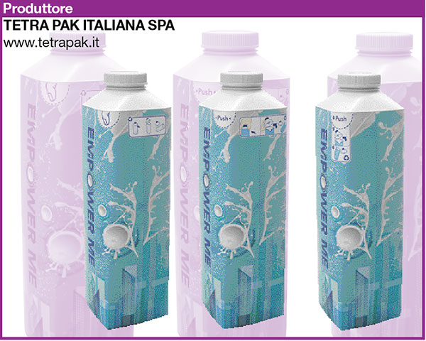
14 Tetra Top® with Separable Top
The packaging helps segregated waste collection. Tetra Top® food board makes separate recycling of materials easier thanks to the the pack’s separable plastic top.
With this solution Tetra Pak® reinforces its environmental leadership in food packaging solutions: the new design of the Tetra Top® container, with the upper part now separable, guarantees quality recycling.
With only a simple gesture, the innovation introduced enables the consumer to separate the plastic upper part from the cardboard body of the container, a pack very common and appreciated for liquid foods such as fresh milk, cream and yoghurt drinks.
Thanks to a pre-cut die on the external layer of the pack, after consumption the plastic top can be separated from the board with a mere press of the thumb: with this gesture in fact one can hence separate the different parts of the packaging in the home, thus facilitating segregated waste collection and recycling.
The new solution does not entail any additional costs either for the production chain or for the consumer and keeps all the food safety features unaltered, guaranteeing max. protection of the nutritional and organoleptic properties of the product, combined with a more practical and functional packaging. All this with the natural appeal of and FSC® (Forest Stewardship Council) certified carton.
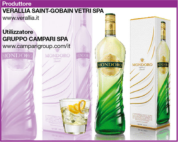
15 Vermouth Mondoro
The vermouth market, aboveall the “white” segment, today presents a packaging with standardised elements: consolidated bottles, transparent glass, though with label & cap with standardized decorations.
This is why Campari has decided to consolidate its position in the category, working on a premium and high quality image, that seems today to be the sole element capable of sustaining growth in markets still not mature, and where margins show growth potential, involving a more evolved and sensitive target, ready to invest in superior quality products.
Mondoro is the Campari brand that, created in the world of sparkling wines, thanks to its expertise has shown great potential. With a view to extending the range, Mondoro’s vermouth packaging echoes the strong and representative style of the sparkling wine segment.
Hence a unique, distinctive packaging has been created that, thanks to its iconic shape, merges the tradition on the world of vermouth (bottle shoulder and neck) to the sinuous shapes and dynamics of the base (the waves), giving a strong visual impact that immediately features in shelf presence. But what really makes it stand out is the green “cladding” of the waves: a colour that is in the DNA of the brand and that helps the product in appearing unique, recognisable, giving it the edge in shelf impact on its competitors in the category.