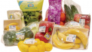

New look for good juices
A new, highly recognizable pack for Natura Buona juices (100% juice and zero added sugar, zero preservatives and zero dyes): thanks to a clean and essential communication, easy to read and immediately understandable, the new graphic design is able to transmit the pluses of the product at first sight.
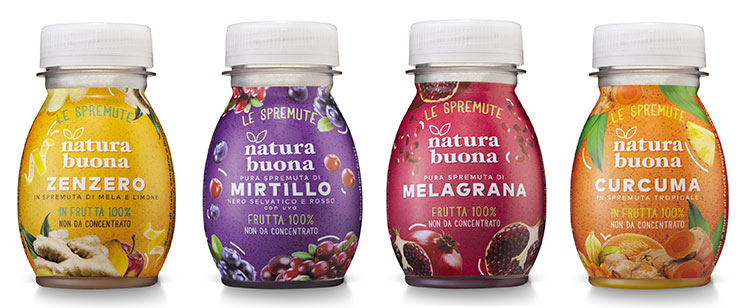
The visual now takes on a central role in the communication of information thanks to the use of icons, emblem of a current language, while the background of a single saturated color enhances both the Natura Buona logo and the images of the fruit, the real protagonist of both the juice and the packaging. This is the recurring element and continuity with the past, together with the unmistakable “pocket” format of the container.
The addition of the claim “Le Spremute” also defines the product category: 100% fruit not from concentrate. A feature that is found written in a new font and that is strengthened thanks to the printing of the fruit in all its freshness and naturalness. Summing up, an image capable of immediately rendering the processing and bottling the product, which maintains the full taste of fresh fruit without having to be kept in the refrigerator, thus allowing a “just like home-made” juice to not only be sold off the shelf, but also to be consumed on-the-go for a daily dose of goodness.