Awarding the magic of perfume
When a fragrance becomes emotion: the 29th edition of the Premio Accademia del Profumo (associated with Cosmetica Italia) once again showcases the communicative and evocative values of the cosmetic product par excellence.
What better than a scent to interpret the eternal duality between desire and need, between the material and the immaterial? Stored in an elegant bottle, it is a real treasure, a skilful blend of raw materials at the same time testimony to a cultural, artistic and scientific heritage developed by professionalism and by companies that make each fragrance unique and inspiring.
Accademia del Profumo, the Cosmetica Italia annual award dedicated to the world of fragrances, celebrates an industrial chain of excellence, which this year will also feature greater visibility at Cosmoprof: presented in an original installation, visitors will be able to try out and vote for the products, both men’s and women’s, that reached the finals to vie for the best perfume of the year.
The pages that follow include a roundup of the perfumes that reached the finals, preselected by the “Nomination Jury”. A technical jury will have the task of nominating the best in terms of olfactory creation, perfume made in Italy, packaging, exclusive big brand and artistic perfumery, while the VIP Jury is to decree the best communication.
Side note. Due to a lack of readily available information some finalist products have not mentioned in the article. Enjoy.
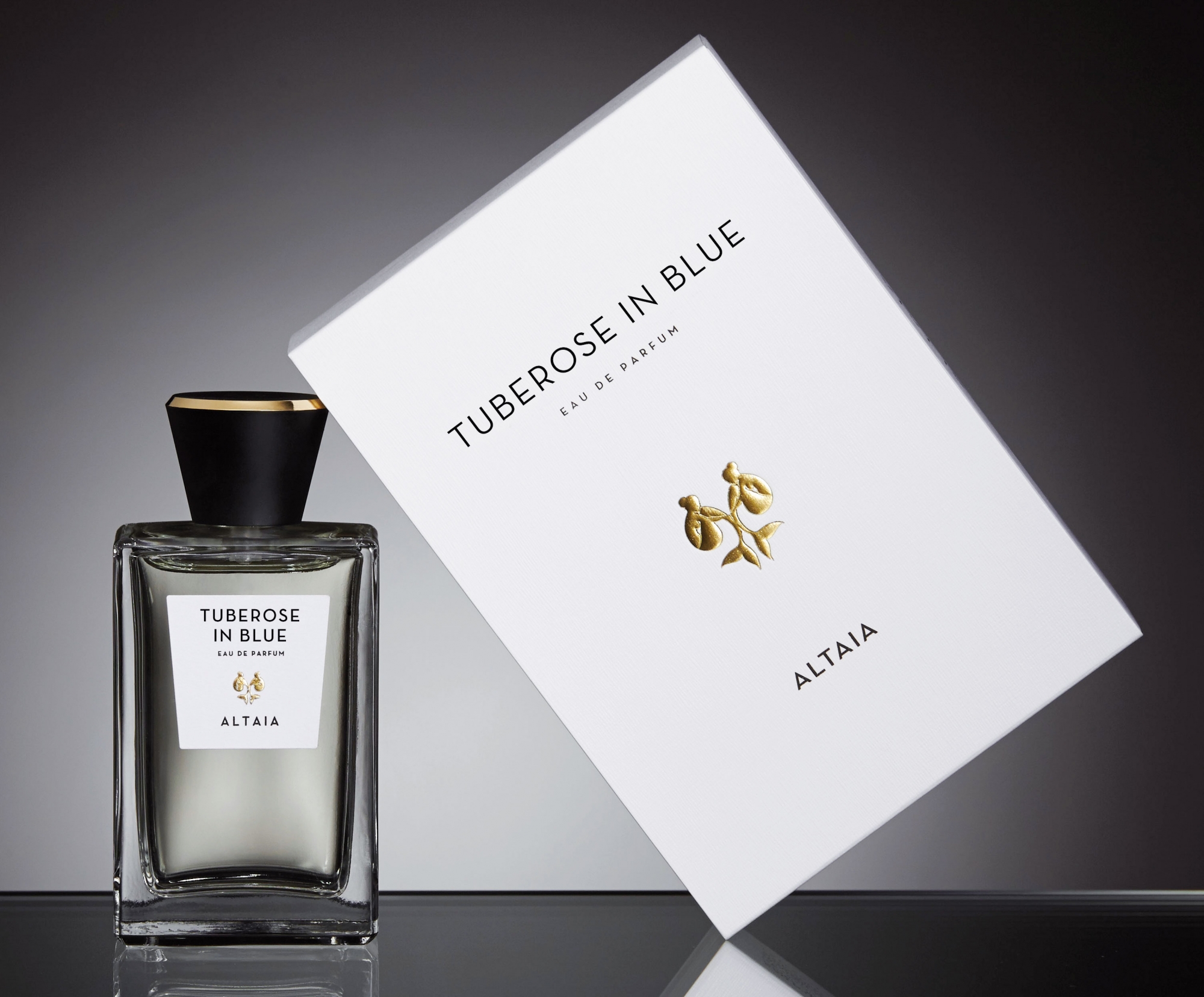
A memorable trip, a stop on the Corcovado, with the car that climbs into a whirlwind of blue butterflies while through the windows enters a sweet scent of Tuberose. This intimate memory of Sebastian Alvarez Murena lives on today in the fragrance of Tuberose in Blue, which is added to the Altaia collection (an acronym for “A Long Time Ago In Argentina”).
The packaging is modern, elegant and minimalist. The box and label, both made from artisan paper, are adorned only with the name Altaia in an exclusive font and the gold leaf of the logo, hot stamped in relief. The Italian-made clear glass flacon is surmounted by a heavy Zamak top with edges and logo laser-etched in gold. The distorted form of the flacon’s interior is echoed by the cap and label.
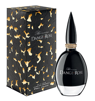
A woman whose personality is both one and many - like the petals of a rose - summed up in the magnetic vigor of femininity: to her Blumarine dedicates its perfume Dange-Rose, which gathers up the essence of seduction in a dangerous challenge of reason and emotion. The packaging wears the values that the perfume encapsulates.
Tactile, rich and elegant, the box evokes refined tailoring, like a baroque dress in gold-tinted silk adorned with velvety jet black petals, the brand and fragrance name interwoven in silver embroidery.
Protected by the elaborate internal case in corrugated card is the gem of a naturally ergonomic oval crystal bottle. Black lacquering on the inner surface of the container holds the mysterious jus, which is exalted by a thick, transparent base. The gold sparkling collar garlanded with rose bas-relief pollards the surprising glossy black glass top: an evocation of ancient tools of adornment - the kohl pencil - or a secret, dangerous weapon that every woman is ready to unsheathe?

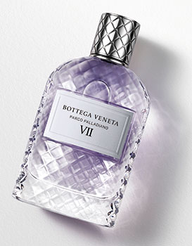
Bottega Veneta Parco Palladiano VII
As with all the fragrances of the maison, the bottle of Parco Palladiano VII reflects and celebrates the extraordinary tradition of craftsmanship that even today distinguishes Bottega Veneta’s creative output. The iconic woven pattern, which evokes the particular way skilled craftsmen handwork the leather for bags and accessories, in fact features as a signature on the bottle - a tribute to Venetian glass art - as well as the metal cap and the die.
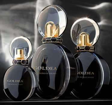
Bulgari Goldea - The Roman Night
Emblem of the Goldea collection, the sign of Serpents* is a Bulgari icon. The hypnotic beauty of a reptile - metaphor for seduction and rebirth, symbol of power of Queens of antiquity - today clads the packaging of The Roman Night, fragrance inspired by the charm of a mysterious goddess of the night that reigns over the eternal city. Embodying the deep bond between the perfume and the woman who wears it, a snake wraps its black and gold coils around the neck of the bottle. The intricate silhouette evokes astral positioning during eclipses, rare and precious moments when the Sun looks like a ring of light miraculously shining around the shadow of the satellite that hides it. Thanks to a sophisticated interplay of transparencies and shots of internal coating, the bottle resembles a black disc bordered by a thin orbit of light; a concentric play mirrored in the cap, the golden transparency of which is enclosed by a thin black line. Even the shiny black paper of the sumptuous case is decorated with a woven texture in relief, with scintillating gold dust, a visual and tactile allusion to the scales of snakes.
* Created in the 40’s, the Serpent collection is one of the Maison’s most popular.
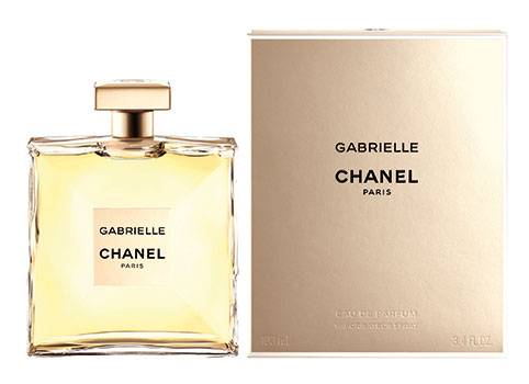
The Christian name of Coco Chanel, Gabrielle evokes an intimate, pure truth, without artifice. In the concept of this perfume, the authentic elegance of a rebel spirit, free of masks, frills and false appearances. And so transparency becomes the stylistic key that inspires the design of the bottle, whose lightness goes against the grain: in fact, it took two months to make the glass walls so thin, and the marloquette (the characteristic curved bottom) has been pushed out and polished. The bottle’s square shape, with simple lines, echoes the iconic shape of classic Chanel perfumes. Symmetrical front and back, on the sides the walls converge toward the center of the bottle, where a quadrangular label - the same size as the cap - is positioned in such a way that the light bounces from every facet. The opaque foil of the cap, half-way between silver and gold, echoes the luminosity of the fragrance. Inspired by the textiles preserved in the maison’s “Patrimoine”. The same luminosity visits the box, which is embossed inside with a patented process, evoking the perfection of a jacket’s lining, faithfully reproducing the silhouette of the bottle, protecting it.
In perfect harmony with the name, which imposes itself as a manifestation of joy de vivre, J’adore inJoy becomes an alive and palpable material.
Thanks to veritable technical prowess, the glass of the flacon has never been so thin. And so, in the iconic bottle, with its gold collar surmounted by a transparent teardrop - the characteristic cap of the J’adore line - the liquid essence of the fragrance imposes itself on the senses in all its crystaline purity: the peach gold jus “explodes” thanks to the round bottom, which disperses light, making just looking at the perfume a total sensory experience.
The elegant, paperboard box is adorned with thin white stripes that shimmer, with the name of the maison and the fragrance logo in relief, between two thin bands at the top and bottom of the box.

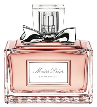
For its Miss, the famous maison proposes a packaging that embraces femininity à la francaise - nonchalant, classic and livened with refined detail. A sliding box framed by silver fretwork displays technical virtuosity: with a light black outline, the pink-hued paperboard echoes in relief the shape of the bottled held within the inner case. On the sides of the two boxes, with identical color shading, a Jacquard pattern transforms them into fine textiles. On the front of the box, the brand stands out in relief against a silver interlace background. In the squat, rectangular bottle, the strong pink of the jus sparkles through thick glass, creating glittering refractive effects. The surface of the wide base takes up the texture of the paperboard, sculpted in low relief. Visible through the transparent glass, the inner profile is flared: the bottom meets the sides with soft, sloping edges. In the discrete niche carved out of the front of the bottle, the horizontal label frames the name of the fragrance, in gold cursive lettering. A touch of gossip? The metallic ribbon adorning the neck of the top, the symbol of Miss Dior.
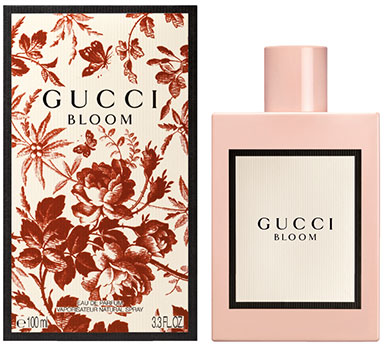
Enveloped in the colors, decorations and motifs of the maison, Gucci women express their femininity freely and naturally, in a perpetual state of bloom. Creative director Alessandro Michele wanted to imbue every note of the fragrance (created by master perfumer Alberto Morillas) with energy and freshness, as well as the packaging concept. The bottle design is conspicuously feminine, not to in order to seduce men, but to “keep company” with the women that wear the perfume, awakening a very intimate pleasure.
The bottle has a delicate retro style, in vintage dusty rose colors. The square shape, with clean, thin lines, is valorized by a surface lacquer that recalls porcelain, on which the minimalist paper label sits with black and white lettering. The exterior packaging is embellished by Herbarium print, a red and white Toile de Jouy motif, cherry blossom branches, within a black frame.
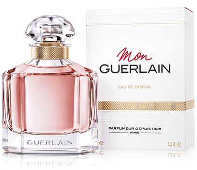
The “quadrilobé” bottle was created by Gabriel Guerlain and produced by the Maison Baccarat in 1908. Inspired by the alchemists’ vials, its name comes from the top, formed from a single mass of glass, curved in shape, and divided that is into four lobes. A casket of mythical fragrances and icon of the Maison, the subject of countless interpretations, today it contains the new Mon Guerlain perfume, a homage to modern femininity, combining strength and sensuality. The bottle design, basic, simple and graphic, plays on the harmonious contrast between the force of the taut lines and the soft curves. The light refracts between faces of a slightly flattened, octagonal based prism. The interior of the massive base of the cup has rounded corners, while on the outside, the Guerlain brand embossed on the clear glass, is barely visible. Geometric shoulders rise towards the neck of the cap, which is surrounded by a golden band with knurled end; the same leitmotif is echoed as metallic finish on the die; the cardstock is embossed with discreet horizontal lines in relief, white on the outside, red on the inside, like the adjective “Mon”, written in italics.
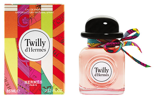
This scent celebrates the joyous impertinence of the girls of today. Free and bold, vibrant and unpredictable, cheerful and imaginative, living amidst a kaleidoscope of stimuli and emotions. Inspired by the playful ease with which these young women wear Hermès silk carrés, a playful and mischievous packaging has been created. The cubic bottle with rounded edges has a heady, compact and manageable shape.
At the centre, the round label is framed by a porthole embossed on the glass. Giving life to the object, with a twist of irony, the black plastic top in the shape of a bowler, “lowered” onto a collar a surrounded by a multicolored bow-knotted ribbon, like a foulard, reminiscent of the patchwork of pop fantasies printed on the die.
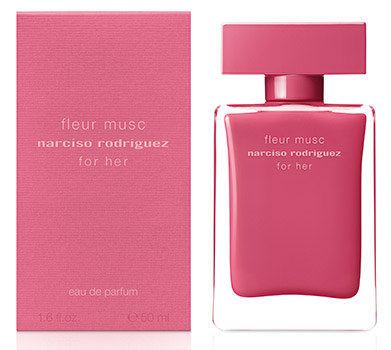
Narciso Rodriguez Fleur musc For her
The iconic collection of Narciso Rodriguez fragrances continues to surprise and fascinate with a new olfactory proposal. For the packaging design of fleur musc, a touch of innovative color adds a chapter of passion in a story that is constantly evolving. The bottle embodies primal beauty: at the heart of the transparent glass cube, the deep awesome pink of the internal lacquering (the result of a unique process developed by Bormioli Luigi) enhances a soft silhouette. The essential and minimalist elegance imposes itself in an enveloping monochrome, broken only by the name and brand reproduced ton sur ton. The same nuance, that reflects the warmth and the indomitable nature of the fragrance, colors the shiny plastic squared top, and the smooth ribbed cardboard case.
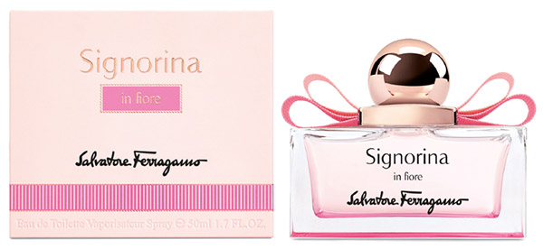
Salvatore ferragamo Signorina in fiore
Based on the colored petals of a flower in bloom, Signorina in fiore is a tribute to the cheerful and carefree femininity of young women.
The unique packaging of Signorina is reinterpreted with a new color accent. The low and squared bottle is illuminated by a vibrant shade of pink, that from the surface of the base is amplified in refraction of the glass fading upwards. The feminine charm is embellished by the pinkish gold spherical cap with metal clasp that gracefully holds the iconic Vara grosgrain bow: the elegant double ribbon, in two shades of ton sur ton pink, fits perfectly on the broad shoulders of bottle.
The same shades color the die, which features the precious details of the simil grosgrain band imprinted on the paperboard, that seems stitched around the box.
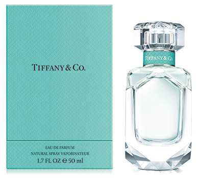
The glass bottle of the Tiffany & Co. fragrance is inspired by the most iconic diamond cuts of the House. The painstaking faceting work at the base conjures up the 128.54-Carat Tiffany Diamond - a yellow diamond with 82 facets, among the most precious in the world - while, the pure geometric lines of the upper part evoke the Lucida® diamond engagement ring. A hint of Tiffany Blue® brings out the neck of the bottle. The top conceals a metal plaque engraved with the Tiffany & Co brand, to ensure authenticity like for a jewel. Inside, an elegant jus in pale blue illuminates the precise cut of the bottle. As for all the jewellers’ creations, the perfume is packaged in the exclusive Tiffany Blue Box, a symbol of style and elegance recognized throughout the world. The weave of the case, like that of the neck of the bottle, is moved by a very fine pattern with the emblematic T design of the Maison.
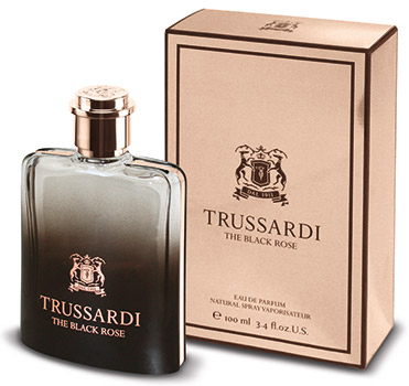
The Rose of Taïf embodies the exotic sensuality of the Trussardi fragrance, The Black Rose adding a new stage in the dream voyage in the Middle East which inspires the collection.
The bottle has the elegance of a jewel box: The dull burnt earth coloring that fades upwards towards transparency, creates a translucent effect typical of smoked glass, that alludes to the changing of hues of the horizon from the desert plain to the mountains. The pinkish tinge of metal top recalls the inserts that surround the sides and the back of the bottle, the metalized printing of the brand, the name of the fragrance and the coat of arms with two greyhounds. The same golden pink luminosity lights up the die on which the logo and framed wording stand out in dark brown; an elegant contrast that makes the case look like a casket that keeps a precious message.
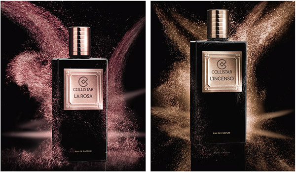
The Collistar Prestige Collection continues to explore the fine fragrance segment with two new Eaus de Parfum, La Rosa and L’Incenso, for her and for him, to be used separately or in combination, in the name of total freedom of the senses.
The glass of the bottle and the paperboard of the box are in the impenetrable glossy black that distinguishes the collection.
The austere, geometric elegance of the design is enriched by a metallic plaque - rosy bronze for La Rosa, anthracite gray for L’Incenso - on which the names of the fragrance and the brand appear discretely, framed by a light arabesque in relief, in classical style, vaguely art deco, which also adorns the sides of the box.
The same metallic nuance appears on the characteristic cylindrical cap of Collistar perfumes, ergonomically and elegantly embellished with horizontal pleating.
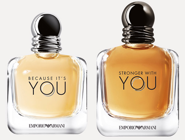
Emporio Armani Stronger with you e Because it’s you
For the design of the new Emporio Armani collection, the modern, essential forms that distinguish the brand’s style are expressed in an interplay of sensuous lines: the rounded profile of the bottles - taller and narrower for him (Stronger With You), compact and uniform for her (Because It’s You) - evoke the robust girth of a man’s shoulders blending with the shapeliness of a woman’s hips, in a synthesis that is at once harmonious, simple and austere, the thick glass conferring the weight of an objet d’art.
The spherical metal cap adds a touch of elegance to the couple, whose neck and base are braced by two rings that cross and separate and come back together again like the bodies of two lovers. A symbol of the unbreakable bond of love, the same couple of rings is recalled by the double “O” in the lettering of YOU - the link between the masculine and feminine fragrances, stamped on the glass bottle and on the box. The latter also bears it as a graphic motif. Design and color palette are essential and minimalist, invoking the essence of love.
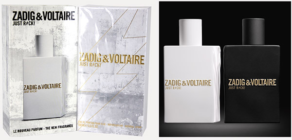
The couple of fragrances Zadig et Voltaire, all in black and white, create a play of contrasts that also involves the materials and the details of the packaging. Emblem of the eternally rock and chic spirit of the Maison and breaking the codes of perfumery, a neon lightning strike-icon of the new line stands out on the front of the die. The graphic elements printed in gold give electric bursts to the matt cardstock of the case, transfigured by a tactile texture reminiscent of a concrete slab.
The two ”broken” bottles of male and female fragrance - identical and specular - placed next to each other are re-united, creating a true and proper art object: the solid glass is matt lacquered, like the raw rock from which it seems to be carved, black for Him, white for Her, on which the gilded characters of the brand glitter along with the name of the fragrance.
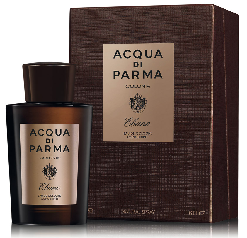
The quintessentially Italian male elegance of Colonia Ebano is reflected in the iconic Art Déco bottle that makes Acqua di Parma’s “Colonia” collection unmistakable. In the impeccable stylistic austerity that characterizes the perfume-maker’s creations, a label with bronze glints warms the chocolate brown of bottle and top, with their characteristic conical shape, imperceptibly flared. The same color palette is taken up by the imposing case, hand-coated in fine paper and embellished with a soft satin lining, signaling the brand’s sartorial quality.
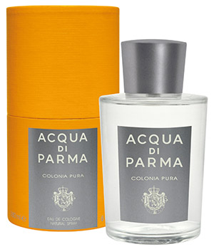
The freshness of Colonia Pura expresses the luminous lightness of moments of intense joy. In similar fashion the version of the iconic Acqua di Parma bottle used for this product makes a striking impact at first glance with its transparency and minimalist elegance, combining the inimitable Art Déco charm of the brand’s iconic, classic lines with matt silver gray elements that emphasize the clean purity of the forms, for a new, sophisticated pleasure. The creations of the brand are an homage to the extraordinary riches of nature: the sky, the sun, the evocative Italian landscapes that are a part of its origins and represent an essential source of inspiration, in addition to excellent raw materials. From this deep bond arises an unwavering commitment to sustainable production models, including for the packaging: from the removable, recyclable pump to responsible local and international supply chains.
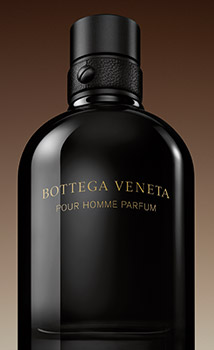
Bottega Veneta Pour Homme Parfum
Faithful to the maison’s principles of artisanal craftmanship, the packaging of Bottega Veneta Pour Homme Parfum pairs an innovative and functional design with premium quality materials, maintaining the continuity of the Pour Homme fragrance collection. The bottle, inspired by the glass art of Murano, revisits the color palette of the original version, moving from its silver gray to a more brightly illuminated shading with gold characters. Once again, the upper part of the cylindrical bottle has been crowned, and holds a secret at its base, where the brand’s distinctive interlace animates the surface. The discrete cap in black lacquered metal hooks onto the equally iconic neck, collared by an elegant leather belt, held in place by a screw. The total black paperboard of the box is also embellished by the famous interlace, on which the name and logo of the fragrance shimmers in gold lettering.
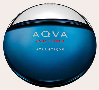
Bulgari Aqva Pour Homme Atlantique
With vigor, freshness and energy this fragrance rejoins the wearer with the primeval and eternal source of life: water. In keeping with the design of the Bulgari AQVA collection, the packaging of Pour Homme Atlantique, proposes its startling concept. The rounded shape of the blue glass bottle joins seamlessly with the silver cap, creating a smooth sphere which encloses the evanescent perfection of a drop of the ocean. On the marine colored die, on a darker background framed in white, the name of the fragrance in Roman script stands out, iconic of a brand that has always drawn inspiration from the harmonious and timeless forms of classic beauty.
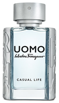
Salvatore Ferragamo Uomo - Casual Life
A bottle with an appealing, contemporary design that captures the impeccably styled dynamism of the Ferragamo Man: thick glass with a slightly concave front, warmly inviting, its shape expressing strength and masculinity.
Reinterpreted in elegant opaque silver, the famous logo signed by Venna* - in cascade relief - hugs the rounded sides of the bottle, facilitating grip. The contrast with the clear blue jus creates a formidable refinement. The dispenser is nearly concealed in the flat, cylindrical cap, surmounted by a glossy plaque bearing the trademark.
On the luxurious silver paperboard box, the logo shimmers in a clearer and reflective ton sur ton. The brand and name of the perfume, printed in black with a hyper-modern 3D effect, confers a final touch of character to this creation.
*A tribute to futurist Lucio Venna, to whom Ferragamo entrusted his first advertising campaign and brand/label in the 1930s.
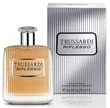
A reflection of the Self and an interrogation of memory. Riflesso, the new male fragrance by Trussardi, explores new horizons of the senses, between modernity and tradition. Essential and elaborate at the same time, the bottle - designed by the award-winning architect and designer Carlo Colombo in partnership with Gaia Trussardi - synthesizes in allegory the lines of a typical male alter-ego: the striated surface of the glass, transparent and luminous, recalls the grill of a car engine, identified by a “license plate” on which appears the name of the fragrance and the brand in relief, stamped in the niche framed by a metallic profile. The embellished zama cap is surmounted by a Surlyn disc that resembles a steering wheel. The result is an iconic object with a vintage feel, retouched with modernity to stimulate the visual memory and rewrite its meanings, imagining a new classic. Metallic, luminous and tactile like the case, the box in silver paperboard with vertical ridges on which is printed the same “license plate” in black, drawing the eye with its original and decisive personality. The interior of the case is decorated with a printed pattern of lozenges with embroidered edges and a greyhound’s head, symbol of the maison.
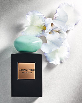
The black bottle Iris Céladon revives the iconic design of the Armani/Privé Collection of fragrances. As elegant and precious as a work of art, its rough and smooth surface resembles a precious mineral, out of which its pure lines, regular and squared like those of a monolith appear to have been carved. The heaviness of the glass confirms its importance. The label is a slightly rounded bronze plate set in the heart of the bottle. A large irregularly shaped cabochon reminiscent of a river stone, made in celadon color resin (a hue between turquoise and teal) gives a refined oriental flavored elegance to the minimalism of the design. Depending on the viewing angle, the top presents nuances unique in each piece. The scent is encased in a rigid casket with magnetic closure, this too block shaped with a square base, in dark brown like the cardboard slide case that protects it.
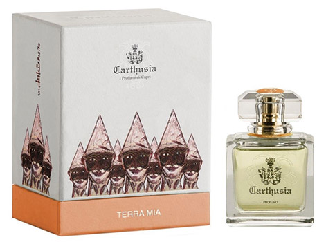
Quality, classicism and sobriety: values that have always inspired the image of Carthusia that once again in the packaging of Terra Mia, shows it knows how to update its historic spirit, without distorting it. Set in the square bottle, the honey-coloured jus glows in the soft silhouette of the internal cavity. A crystal cabochon - a low and elegant faceted prism - elegantly tops the bottle that on the front bears the Liberty image of the floreal siren, emblem of the company and expression of the classical heritage of Capri between myth and nature. On the back the logo is etched into the glass with impalpable lightness. The two images, in transparency, seem to be inscribed one inside the other, and also appear so on the case in stiff cardboard. The white of the paper that covers it like a handmade fabric is warmed by the tones of orange at the base and the pictorial icon that decorates the sides: the mask of tradition that makes one laugh and cry together, a Punch replicated to infinity, the work of the Neopolitan artist Lello Esposito who painted it exclusively for the brand.
* Carthusia gathers the legacy of an ancient tradition, that of the monks of the Certosa who from 1681 devoted themselves with skill to an art of perfumery based on the essences, spices, herbs and aromas of the island. Much has changed since then, but the care in working with strictly natural methods remains the same.
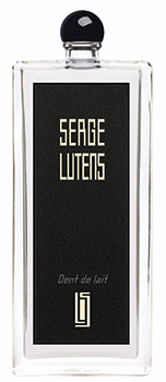
The “milk tooth” by Serge Lutens is hardly that of an innocent child. Sweet but with character, bright and assertive, its bite is “wickedly” infantile. The packaging revives the iconic lines of Collection Noire signed by the Maison. The bottle is a thin parallelepiped tapered upwards. The cap, small black plastic ball screwed on neck, is to be replaced with the dispensing pump, supplied separately in the same case. The black label, contrasted by the white graphics of the brand and logo, covers almost all the glass of the front face, as if it were framed by its own transparency, through which we can glimpse the soft and irregular silhouette of the inner recess, full of jus. On the total black die the ribbed texture of the cardboard creates a tactile contrast with the smooth rectangle framed in relief, as concentric as the bottle label, on which the milky characters of the brand stand out.
