From the sea to the moon with Tonutti Tecniche Grafiche
Labels with semi-transparent paints reactive to UV lamps: spectacular result.
Premium labels, creativity and a key concept, “aMare” (from the Italian “mare”, meaning sea, and “amare”, meaning love), that forms a connection between passion and nature. These are the cornerstones of the participation of Tonutti Tecniche Grafiche at Packaging Première & PCD 2024. Tonutti, an Italian and international market leader in premium labels for a variety of sectors, and in particular the beverage, pharmaceutical, cosmetic and food industries, took part in the trade show in Milan with three projects. Marketing Communication Manager Barbara Pagnutti explains:
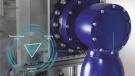
«The first, Querelle, by the designer Massimiliano Gosparini, is a triptych of rum labels, representing the battle between sailors and a large octopus. The battle is purely symbolic, because only peaceful coexistence between the species can guarantee our future. As regards the technique used, the semi-transparent paints used give the sea and the octopus a «wet» appearance. The multiple layers of the processes applied create a narrative for the design».
Material effect
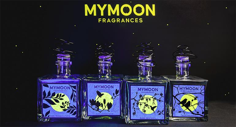
«The second project, by Barbara Passon» continues Pagnutti «is My Moon, a home fragrance diffuser, with four variants, representing the different seasons of the year and of life. There is a different fragrance for each season, and the label also changes to reflect the elements that characterise each season. The moon is created with a fluorescent paint that reacts under a UV lamp, and a paint containing grains of sand was used to create a strikingly material effect».
Aspects of excellence
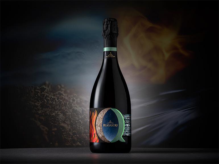
Packaging Première & PCD hosted the world preview of the third project.
«This co-marketing project, in collaboration with NSG Design for Ruggeri» concludes Pagnutti, «involved numerous professionals from the world of packaging, and a large number of processes. The result is a premium label featuring flames created using a cusp die with nano engraving, sanded painting, a mix of debossing and embossing in the centre and holographic foils. The inspiration comes from the four natural elements».